MB II Desktop Icon

Posts
6
Likes
17
Created a custom movie battles 2 icon, to replace the original, figured I would drop the PNG here if anyone wants to use it! The forum nor Imgur support the '.ico' format so you'll have to take it over to icoconvert.com to drop it in and convert it. If you want to get rid of the UAC administrative shield on this icon or the even the default one you can follow this guide Elevated Program Shortcut without UAC Prompt - Create - Windows 7 Help Forums. Also including an image on my desktop, made it mainly to go with my other star wars titles.
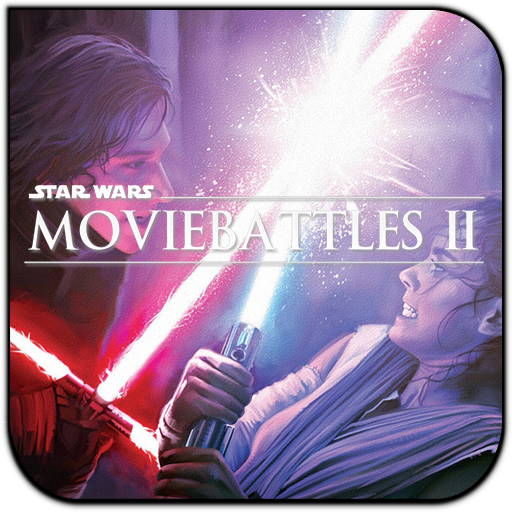
mb2.png
 

Attachments

  • Capture2.PNG
    Capture2.PNG
    169.4 KB · Views: 363
Upvote 0

Fletcher Time

Master of Puppets
Donator
Community Liason
Moderator
Posts
240
Likes
210
I really really like this! Dev's, would you consider this if the community supports it overall?

Edit: Updated for my desktop (didn't have time to create a process for it) :
x0bkICl.png
 
Last edited:

ent

Movie Battles II Team
Posts
848
Likes
390
Don't get me wrong, but it has too many details for an icon, the title is barely visible, and so the icon content.
Try to follow at least Windows guide on how to make icons or just simplify it.
 
Last edited:
Posts
6
Likes
17
Don't get me wrong, but it has too many details for an icon, the title is barely visible, and so the icon content.
Try to follow at least Windows guide on how to make icons or just simplify it.
In my opinion, the skeuomorphic designs of windows past are outdated. If I were to develop an actual icon, for commercial use, I would recommend focusing on fluent design like windows now uses, or material design like google. This icon and the entire set are designed to be used scaled up as the focus of the desktop, for example, they are roughly an entire inch or more across on my personal desktop (end up treating them like old game box art on a shelf tbh). Regardless of that, just wanted to share it for anyone else's personal use!

Full_Screen.PNG
 
Last edited:
Posts
6
Likes
17
I understand, I wasn't trying to make a new official icon and I wasn't following professional design guidelines for legacy or modern windows. I'll see if I can make something more fitting for the community? This one was not developed with any design standards in mind other than the fence I placed it in. Just wanted to post a tile style icon I made for use on my own desktop, for others in the community to use if they wanted.
 
Posts
6
Likes
17
No offense taken, I didn't expect design input lol. But while it's coming, I want to try to make a more generally usable one! Mocked up a quick draft in about 20 minutes if you guys have any input. Obviously, textures and colors are placeholders. But let me know what you think. :)
quick_draft.png quick_draft_border.png
 
Last edited:
Posts
18
Likes
7
In my opinion, the skeuomorphic designs of windows past are outdated. If I were to develop an actual icon, for commercial use, I would recommend focusing on fluent design like windows now uses, or material design like google. This icon and the entire set are designed to be used scaled up as the focus of the desktop, for example, they are roughly an entire inch or more across on my personal desktop (end up treating them like old game box art on a shelf tbh). Regardless of that, just wanted to share it for anyone else's personal use!

View attachment 2464
is that a rain-meter skin i see you using? I like the minimal approach you have
 
Posts
6
Likes
17
is that a rain-meter skin i see you using? I like the minimal approach you have
I appreciate it! That's why I started making these damn icons in the first place lol. Actually its Fences by Stardock, I've been using it for years and I highly recommend it. The roll-up tabs I have at the bottom hide miscellaneous debris as well, its a godsend.
 
Top