General feedback on the new patches

GoodOl'Ben

Nerd
Donator
Movie Battles II Team Retired
Posts
1,116
Likes
1,656
Came back for a bit to see how the game's going. Loving it! There's so much new stuff to experiment with and explore.

Felt like I needed to jot down some of my discoveries just to see what others are thinking. I'll try to keep this short and sweet.

Maps

New map updates are good. Nice focus on adding new avenues of attack and introducing verticality by giving all classes access to areas previously only reachable by select few.
  • Deathstar in particular felt better great to play on the attacking team
  • Corellia is superb! So many fun places to play in
Next map I would revisit is Smuggler. The only thing it requires is making the datapad room impossible to camp with 5 droidekas. Decreasing the room depth back to its old proportions is all you need, this way it's easy obliterate with explosives. Camps in that room go against what the map is all about.

Keep up the good work! I'm sure I've missed some changes as I haven't had the benefit of playing all maps yet.


Gameplay

I was fairly suspicious of this coming in. It's in a slightly different direction than I would've gone. One thing we clearly were in agreement with was FP drains. Shots pack a punch and it's not possible for jedi/sith to just hang back. They need to make choices. So far I've had the feeling that there might be very little sith/jedi can do at times when they run out of FP except die. Considering how fast it happens, it's a bit tricky. Perhaps explore lowering FP costs for some abilities? Looking at you Speed. Or a maybe slightly faster FP regen in certain situations? Perhaps even something like killing someone granting a brief regen buff?

There are some curiosities too. I feel like Jedi/Sith are knocked down for shorter than they used to. I'm talking 200-400ms, but it's there and noticeable. Perhaps reduce it for other classes too if you're going this direction? Push and Pull could knockdown for shorter for example? Which in turn could warrant reducing FP costs.

Lightning seems to have knockback, which is mad oppressive. The counterplay used to be to flank to the sides up close, but it's not possible when you're being pushed back. Lightning is already strong in its utility, adding this has really made it way too strong.
  • Secondary nerf is great, introduced variety through reduction, just buff the damage a bit to reward direct hits
  • Mandalorian rocket nerf is whatever, didn't seem to affect my Mando play, managed to stop a few rockets from firing, but they seemed like misses anyway
  • Pulse grenade AOE nerf seems unnoticeable in regular mode, didn't see how it affects launcher pulses yet
  • Lightning knockback is awful
  • Knockback in tandem with high FP drains really increases the skill requirements for Jedi/Sith. Good players are still amazing though.
  • The Westars/Clone pistols having center focus is whatever, after a while I reverted back to using the original way since it's easier to fire straight that way, the jumpy double crosshairs is confusing. Disabled it in the options, but it always seems to revert back at launch.
  • Wookiee point changes are whatever, didn't notice how they changed things
  • ARCs getting Dex 2 for free is annoying as someone who hates how it works. I used to play Dex 0/1 and having to do those slow high jumps instead of the short ones is annoying and killed me all the time. Give Dex 1 for free and make Dex 2 cost like 1-2 points or something.
I focused overall on things that caught my attention in some way, but overall the gameplay was great fun. I was enjoying myself a lot.


UI update

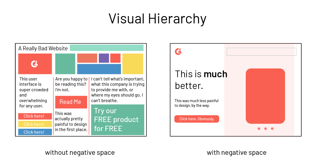
This is sadly a part where I think the mark has been missed by quite a bit. The improved user flow is there, it's fast to use when you get accustomed to it but... There is a big BUT. Keyword I would have is visual hierarchy. I had a hard time distinguishing where the buttons are. You need to indicate buttons to the user much better. I had a hard time finding the buttons even after repeated uses. The choice of using flat design combined with a monochrome color palette really limits your options as a UX designer. Either don't adhere to flat design as hard or introduce more colors.

Some elements are oversized and take up too much space. Most noticeably the team scores and timer. It's a combination of the choice of fonts, sizes, colors and positioning. The element is too big, the text is too thick and the team colors are too flamboyant and eye-catching. It's almost competing for my focus with the gameplay.

In terms of function, I already have the TAB button to check what's the score. Funnily enough there is one thing I always keep hammering TAB for during gameplay and it's not that. I use TAB to check how many enemies are alive and who are they. Perhaps the number of players alive would be better indicated there instead. This might also help mitigate the problem of teams getting out of balance from time to time by increasing player awareness of the team balance.

I often found myself fumbling around the settings trying to find everything. With there being so many tabs to navigate, I kept losing my focus. Things that have more options, I wouldn't have 2 tabs, eg "Crosshair Options 1" and "Crosshair Options 2", instead I would add some kind of subtabs to navigate within that context.

What I do like, however, is the customization! Being able to decide the colors, opacity and everything of most elements was a big save, considering how heavy everything felt with the default settings. My biggest gripe here was that I was not able to lower the opacity of the top right minimap. Having it absolute black and white really makes it a dominant and eye-catching element. However I'm not supposed to be looking there so often. It's there when I need it, but it's not that important.

The team overlay improvements were a good idea. It still takes up quite a bit of space. Do you think it could be possible to reduce the size even more?
  • Faster flow when learned
  • Weak visual hierarchy
  • Great customization
  • Too large elements

Legends

It's cool to see that it is a popular mode. It's not quite like I originally envisioned it when I started it, but amazing nonetheless. Frenz has added his unique bombastic flair to it by going far more over the top with the characters. You can feel the passion that's gone into it. I think that has lent itself to something unique and fun that was previously only available in UMad to the people who went out of their way to download that mod.

I would still like to throw out the classic design quote cliché ;)

"Perfection is achieved, not when there is nothing more to add, but when there is nothing left to take away."

So in that vain, I think many characters are a bit too strong in all the things. A good example of this is Palpatine. He 1-shots everyone with his crazy AP modifiers and has all the Force Powers and all the stances and everything. What's his weakness?

This in turn reduces the fun in choosing between characters. You're not considering trade-offs, you're not considering the map, you're not considering team composition or character synergy. Characters could be reduced to having one super strong aspect. Perhaps one way to begin balancing would be to assign a point value to every ability and have a point quota.

What I do love is how actively the mode has been patched and it feels like the community has made it their own. Frenz has surrounded himself with people that help him in and out of the team to push the mode further and that's exactly what I wanted to see when programming it on top of the easily customized FA templates. I have a feeling that Legends will offer players a way to mod the game in the future if there ever was a catastrophic event where all source code was lost.

Models

A lot has been added! So many characters to play as and it's almost stretching my knowledge of the lore at times. There's certainly something for everyone. At times it feels like there are characters that I don't think are worth the bandwidth, but then again I'm seeing people play as them so what do I know? :)

I had a talk with Unguided about this already, but some models seem to share silhouettes and key features and are in different teams. Especially had this happen with a lot of the models that were from base. Some bountyhunters look like they could be elitetroopers or some rebel soldiers looked like they could be imp commanders. This led to me shooting teammates a lot more than they deserve.


Overall

Heaps of improvements and changes have really refreshed the game. It's hard to believe how far we have come since 2003. The team has done an excellent job pushing the mod forward. It feels like the game has upgraded itself to the 2020s nicely. I can't wait to see 2030!

An idiot said:
I'll try to keep this short and sweet.
Nicely done.
 

MaceMadunusus

Level Designer
Donator
Movie Battles II Team
Posts
1,888
Likes
2,570
The update's been a mountain of work,

Mountain isn't even a good enough descriptor. It took me at least 200 hours in July of 2019 just redoing the base parts of the main menu and settings menu. Something that would have taken me 20 hours to do in UE4 took 10x the time. Spaghetti literally had to develop completely new tools to deal with some of the issues I was having with working with the UI quickly, just so I didn't just /kill myself because of how literally insane it was driving me. This UI took more than most of the levels I ever created did.

You say you want to reduce font weights and stuff like that on the timer, when that literally makes zero sense to do, and we will never do in the actual build. You say that oh you shouldn't have increased font weights on read only items. That is the most ludacris thing I have ever fucking heard, and is not an actual UI standard. Its actually really frustrating to me to play games like CSGO when they have the tiny as fuck timer in the top. And that is when the timer is less dynamic than ours will be with the additions that have been added in the backend for the recent gamemode/objective additions.

My starting idea is to move the point assignment as the right-most panel. This way the okay button is situated more appropriately for the user. I noticed issues with certain tooltips overlapping with back/okay, which I think can be solved with some clever use of new features you've made.

There is a UI mode that puts the build templates as the default view on the right. Which makes you go Select Team - > Class -> Model -> Template on the right -> Okay on the right. You are literally going to break that flow with a less used flow (using the points menu itself) and then clicking okay on the right. Did you even try to understand our current UI at all to even start doing things on it? Because it is clear you haven't. Also, its even more clear with the tooltips thing, because that code is currently broken and not allowing me to change fonts via UI presets and adjust the bounds of it... so it needs to be unfucked. The tooltips completely turn into garbled nonsense that cant even be recognized as text when you try and change the font currently.

This applies to the broken selection tracking for example. It is still a UX issue even if we bury our heads in the sand by saying that it takes too much effort to fix. With that said, I think I have a way to hack around that issue with no C code required, fingers crossed.

Oh god I can't with this statement. Let me guess, you're going to try and do a cvartest with ui_holdteam and ui_class?
 
Last edited:

GoodOl'Ben

Nerd
Donator
Movie Battles II Team Retired
Posts
1,116
Likes
1,656
Its actually really frustrating to me to play games like CSGO when they have the tiny as fuck timer in the top
Do not mistake font weight with font size.

There is a UI mode that puts the build templates as the default view on the right.
Again sounds like you're misunderstanding what I'm saying. I'll show you once it's done.

Let me guess, you're going to try and do a cvartest with ui_holdteam and ui_class?
No. I'll add an indicator element to the corresponding class view.

Here's some good reading on the subject.

Here's a good caricature example of where I'll be going with this.

visual%20hierarchy%20negative%20space.png


Either way, you won't have to argue against me as I'll be doing this regardless. I'll be doing my best to maintain the same number of clicks where applicable.

not an actual UI standard
Probably because it's a UX standard.
 

Spaghetti

Floating in the void
R2D2
Movie Battles II Team Retired
Posts
1,637
Likes
1,633
I think you misunderstood what I said. Sorry for wording it poorly. The update's been a mountain of work, I have not questioned that. What I meant is that providing critique on the current UI should not be limited to things that can be improved with minimal effort. For example we should not limit our scope by saying "Oh that's a hard-to-fix bug, so why even bring it up? You should know better." This applies to the broken selection tracking for example. It is still a UX issue even if we bury our heads in the sand by saying that it takes too much effort to fix. With that said, I think I have a way to hack around that issue with no C code required, fingers crossed.
Fair enough then if I misunderstood. I still wouldn't characterize things like the team tracking thing being anything but a minor issue though given the context in which it actually happens (you're already in-game on a team you should be aware of). If you have a way of fixing it that doesn't cause issues elsewhere and doesn't make maintaining the menus unreasonably difficult then great. It's probably not something anyone else would look at right now given the current development priorities and very limited manpower (and I'm only partially talking about trying to get new things like CTF out the door).
 

FrenzY

Chaos Connoisseur
Moderator
Movie Battles II Team
Posts
558
Likes
493
You get at least one free shot at most ranges where you'd directly hit an alt-frag, meaning that one well-placed headshot with P3 is an instakill and with E11 primary they have at best around 15-20 hp left. With a bowcaster they'd have around 10 hp left. That's a crippling amount of damage to any Jedi and virtually any followup would kill them. For a Jedi who has taken any chip damage during a round, that is lethal. It's quite strong now, especially considering a frag soldier has 3 of these.
I think the issue I see with alt frags currently is less related to damage and more related to how much they yeet people, making it really difficult to get a shot in after. This is probably the 'pseudo getup speed increase' that @GoodOl'Ben was feeling. If you secondary a Jedi, you basically have no time to switch to a weapon and shoot them before they get up. I imagine if we were to time this process, it would be a very small window of time. If they roll it's more reasonable, though.

Thing is, I don't really want to change the yeet, as it is fun and allows for some goofy kills.
 
Last edited:

GoodOl'Ben

Nerd
Donator
Movie Battles II Team Retired
Posts
1,116
Likes
1,656
I still wouldn't characterize things like the team tracking thing being anything but a minor issue though given the context in which it actually happens (you're already in-game on a team you should be aware of). If you have a way of fixing it that doesn't cause issues elsewhere and doesn't make maintaining the menus unreasonably difficult then great.
It's very much minor. There's something that jolts in me when I don't see my team or class selected as active. It's kind of that "Did I leave the stove on?" feeling you get when it's not consistent. These types of things scream to me as lack of polish and weaken the presentation. The fix ought to not cause any maintenance hell if I can manipulate items from outside their own contexts.

This is probably the 'pseudo getup speed increase' that @GoodOl'Ben was feeling. If you secondary a Jedi, you basically have no time to switch to a weapon and shoot them before they get up.
I felt this when using blobs as well, so it was not a sensation exclusive to secondaries. My old common experience used to be pumping 2-3 shots post knockdown with CR2.

One suspect could be a case of meta progression, which I've definitely fallen off of. Players may have become better at performing quick getups immediately after knockdowns. We're very far from the golden days where 50% of the Jedi you knock down perform the front getup kick when they are downed.

Another possibility is weakened muscle memory at least in the case of sec nades. Doing a quick change after tossing a nade is possible, but I might be off my game there.

So it might be a classic case of a scrub imagining problems that aren't there on my part.
 
Last edited:

Lee

Posts
102
Likes
35
Remember when posting "This is good, good job on this, I love this" posts were banned from the forums? It honestly seems comical and unbelievable that such a time existed. If I can delete 95% of your thread and not subtract a single point of discussion....SOMETHIGN IS WRONG.
 
Posts
278
Likes
361
@GoodOl'Ben How difficult do you think it would be to create a tool that allows someone to edit the UI in a more visual way? From my brief stint into modding a different font into the game it seems like making a library of UI components wouldn't be too hard.
 

GoodOl'Ben

Nerd
Donator
Movie Battles II Team Retired
Posts
1,116
Likes
1,656
@GoodOl'Ben How difficult do you think it would be to create a tool that allows someone to edit the UI in a more visual way? From my brief stint into modding a different font into the game it seems like making a library of UI components wouldn't be too hard.
Not easy, I'm afraid. This would require some major programming, which probably wouldn't pay itself back in terms of time invested any time soon if developed. I can see the allure though.

The current setup is fairly snappy to work with as is if you have a background in things like JavaScript or CSS. The drawback of course is that it does take time to open/close the game every time you want to see your changes.

The UI currently consists of components that are already subdivided to some extent, so editing the various .menu files is already fairly snappy since you'll find what you're looking for relatively quickly.
 
Posts
278
Likes
361
The drawback of course is that it does take time to open/close the game every time you want to see your changes.
Thankfully there is a way to hot-swap most of the UI elements via a simple console command 💪

I guess my main issue lies with the fact that I had to edit the same "Back" and "Confirm" button around 20 times because they were not easily find & replaced. The workflow sucks is what I'm getting at.
 

GoodOl'Ben

Nerd
Donator
Movie Battles II Team Retired
Posts
1,116
Likes
1,656
Thankfully there is a way to hot-swap most of the UI elements via a simple console command 💪
Oh, I didn't know about that. I've been going all OG on it until now. What's the command? :D


I guess my main issue lies with the fact that I had to edit the same "Back" and "Confirm" button around 20 times because they were not easily find & replaced. The workflow sucks is what I'm getting at.
Hear, hear. Sadly it's probably as good as it gets. I think hypothetically some structures could be named/nested differently to make things easier to work with, but that refactoring work would also be pretty huge.

I recommend getting a solid IDE with good basic workflow enhancing macros and features to make work a bit snappier.

What I did was move all the files into a folder structure that reflects the pk3 hierarchy and then open up the entire folder as a "project" in Sublime Text 3. Sublime is a nice text editor that provides some good macros and functionalities that make working faster. Especially the marcos that allow you to search/replace through the entire project for a specific set of text :)
 
Posts
278
Likes
361
All courtesy of @MaceMadunusus:

+set fs_dirbeforepak "1" in the launch options. This will prioritize dirs in your MBII folder over the .pk3 files.
1628064683257.png


Then when you are in-game and you made a change you can type
Code:
/ui_load
for all non HUD UI elements and
Code:
/cg_loadui
for the HUD

WARNING: In some cases pk3 files still get priority sadly so its best to uninstall any UI mods before you go to town.

I did try to refactor as much as I could but in some cases its just not possible and the only way to find out is to cycle through every menu in game ;)
 

GoodOl'Ben

Nerd
Donator
Movie Battles II Team Retired
Posts
1,116
Likes
1,656
All courtesy of @MaceMadunusus:

+set fs_dirbeforepak "1" in the launch options. This will prioritize dirs in your MBII folder over the .pk3 files.
View attachment 6274

Then when you are in-game and you made a change you can type
Code:
/ui_load
for all non HUD UI elements and
Code:
/cg_loadui
for the HUD

WARNING: In some cases pk3 files still get priority sadly so its best to uninstall any UI mods before you go to town.

I did try to refactor as much as I could but in some cases its just not possible and the only way to find out is to cycle through every menu in game ;)
Oh man, now I started drooling. For menu programming, one interesting WYSIWYG solution could be to have some kind of file change listener that you can turn on. Where saving a file would trigger a ui_load or cg_loadui automatically. This way you could hypothetically keep programming and changes would be happening automatically before of your eyes.

This could perhaps be done outside the context of JKA even. I'm thinking some kind of unholy marriage between OG Killtracker tech and CSS/JS watchers. Could be that one of those could be extended and it pipe /ui_load or /cg_loadui to the JKA console.

I just got super stoked :D

Edit:
Seems like there are some filewatcher solutions out there that can be set up to do just that.

The only thing I don't know is how Killtrackers macro up commands to jamp.exe. If those are done with cookie cutter windows params, you're all set ;)
 

Spaghetti

Floating in the void
R2D2
Movie Battles II Team Retired
Posts
1,637
Likes
1,633
Automatic watching probably would not be worth it as you have a limit on the number of times you can invoke ui_load before the entire module kills itself. You won't hit it too often but I've still managed to during long tweaking sessions.

Pulling up the console and using the last command is honestly not that bad though given reloading the UI makes you lose the context of all of your currently opened menus anyway. To me that's the most annoying part. An alternate ui_load command that saved some context would be neat but probably a pain to program.
 

GoodOl'Ben

Nerd
Donator
Movie Battles II Team Retired
Posts
1,116
Likes
1,656
Automatic watching probably would not be worth it as you have a limit on the number of times you can invoke ui_load before the entire module kills itself. You won't hit it too often but I've still managed to during long tweaking sessions.

Pulling up the console and using the last command is honestly not that bad though given reloading the UI makes you lose the context of all of your currently opened menus anyway. To me that's the most annoying part. An alternate ui_load command that saved some context would be neat but probably a pain to program.
Many thought pressing F5 to reload the web page was no biggie either, but the increase in productivity with an automated refresh is huge for a programmer. It's one less repetitive task to perform. The saved seconds ramp up very quickly with fast iteration.

How many times does it take before ui_load nukes the whole system?

And yeah, tracking context would probably be pretty difficult to do fully. Modern node.js dev envs are almost there after 10 years, so if something like that could be done for MB2, that'd be a near-impossible feat.
 

Spaghetti

Floating in the void
R2D2
Movie Battles II Team Retired
Posts
1,637
Likes
1,633
Many thought pressing F5 to reload the web page was no biggie either, but the increase in productivity with an automated refresh is huge for a programmer. It's one less repetitive task to perform. The saved seconds ramp up very quickly with fast iteration.

How many times does it take before ui_load nukes the whole system?
I honestly have no idea. The limit could even vary depending on what is actually causing it to die. But there definitely is a limit.
 

GoodOl'Ben

Nerd
Donator
Movie Battles II Team Retired
Posts
1,116
Likes
1,656
A bit of an update on the UI work. It's going pretty well, the /ui_load function is a lifesaver. Binding it to F5 has already improved the workflow greatly. Since I usually work on this like 1-2 hours tops, I haven't had a crash yet.

I'm having fun figuring my way around the template system since I haven't really touched this part of JKA that much before. There's still much to do, but I feel like I'm making good progress.

I've made it so that the team and class selected are always tracked. I've reduced the font-weight of the class counters to reduce emphasis. I might still do the same for the team counts, as they are still thicc.

image_2021-08-11_18-57-32.png


I reduced some hierarchy inconsistency by reducing the size of the "Save" and "Delete" buttons for the templates. They no longer conflict as hard with the "Ready" button. I've also moved the tooltips for them underneath the buttons, it's not shown in the example here.

The point menus now have a distinct hover effect to better indicate that there is an action that occurs if you click on it. I've also removed the large "i" icons to reduce visual noise. The information is now displayed on hover of the entire element if there is any.

I do have a question about all this "UNKNOWN" stuff. I assume it's stuff that is to be added later? It has a very unfinished feeling to it. Perhaps there could be a way to simplify these into a bar diagram to make it simpler? This a lot of information being fed to the player in one location and moving the more nuanced information to our wiki (and promoting it more visibly in the launcher) and/or the in-game library to prevent overload.

The videos are great. I would probably put a single unified diagram for all applicable weapons and a brief description underneath them instead of confusing people with numbers and sometimes cryptic icons. What does C stand for? What's the downwards arrow?

image_2021-08-11_19-37-41.png


In terms of the in-game timer, I've reduced emphasis by lowering the font-weight. I've also reduced opacity of the overlapping timer background graphic to make it less pronounced. The difference will still be many-fold with higher opacity UI settings, but at least this way it doesn't jump and scream at you as hard.

shot0101.jpg


Current changelog:
  • In-game timer font-weight reduced
  • In-game timer background opacity reduced
  • Currently active team stays indicated with a highlight when returning to the menu
  • Currently active class is indicated with a highlight
  • Abilities have a hover effect
  • Ability information "i" icons removed and replaced with a general hover over the ability row
  • Font-weights of class player counts reduced by swapping to lighter font
  • Emphasis of "Save template" and "Delete template" reduced by making the buttons smaller
  • Tautology removed by removing the word "template" as context already implies target subject
  • Visual hierarchy improved by placing the template saving hover tooltip underneath the button instead of above
  • Character stats element moved underneath the class points for now
  • Renamed "Okay" with "Ready" to imply function a bit more clearly, still considering bringing back "Apply", but only if player opens it again
This is a start, but there's still heaps I want to do.

Some changes I'm thinking about:
  • Narrow the lines that indicate a sub-ability to make them less bulky, consider removing altogether if they still feel noisy, the indent might suffice to signal that they are sub-abilities
  • Highlight the "Ready" button with a highlight color
  • Highlight selected team in the same way as selected class
  • Adjust spacing of character stats
  • Add a spacer between character stats and the point loadout
  • Consider moving ability related hover tooltips to the right panel and replacing the generic tooltip with a hint "Left/right click to add/remove points to ability"
  • Standardize class template spacing
  • Test out ways to hide the model selection when it is not needed to reduce visual noise
  • Find a way to fix the disjointed hilt menu by getting the two elements next to each other instead of being separated by the class build
  • Add titles for the sections to describe function eg., "Choose model", "Build template", "Class Build"
  • Ability information cards should hide the template selector menu underneath when they are active to avoid overlap
  • Adjust ability information card icon margins and sizes to reduce noise
  • The center tooltips seem to underneath the black background they've been given, need to see what can be done there
  • Consider size, order and visibility of main sections improve flow

Any thoughts on the progress so far?
 
Last edited:
Posts
752
Likes
626
A bit of an update on the UI work. It's going pretty well, the /ui_load function is a lifesaver. Binding it to F5 has already improved the workflow greatly. Since I usually work on this like 1-2 hours tops, I haven't had a crash yet.

I'm having fun figuring my way around the template system since I haven't really touched this part of JKA that much before. There's still much to do, but I feel like I'm making good progress.

I've made it so that the team and class selected are always tracked. I've reduced the font-weight of the class counters to reduce emphasis. I might still do the same for the team counts, as they are still thicc.

View attachment 6311

I reduced some hierarchy inconsistency by reducing the size of the "Save" and "Delete" buttons for the templates. They no longer conflict as hard with the "Ready" button. I've also moved the tooltips for them underneath the buttons, it's not shown in the example here.

The point menus now have a distinct hover effect to better indicate that there is an action that occurs if you click on it. I've also removed the large "i" icons to reduce visual noise. The information is now displayed on hover of the entire element if there is any.

View attachment 6312

In terms of the in-game timer, I've reduced emphasis by lowering the font-weight. I've also reduced opacity of the overlapping timer background graphic to make it less pronounced. The difference will still be many-fold with higher opacity UI settings, but at least this way it doesn't jump and scream at you as hard and achieves what the design intended.

View attachment 6313

Current changelog:
  • In-game timer font-weight reduced
  • In-game timer background opacity reduced
  • Currently active team stays indicated with a highlight when returning to the menu
  • Currently active class is indicated with a highlight
  • Abilities have a hover effect
  • Ability information "i" icons removed and replaced with a general hover over the ability row
  • Font-weights of class player counts reduced by swapping to lighter font
  • Emphasis of "Save template" and "Delete template" reduced by making the buttons smaller
  • Tautology removed by removing the word "template" as context already implies target subject
  • Visual hierarchy improved by placing the template saving hover tooltip underneath the button instead of above
  • Character stats element moved underneath the class points for now
  • Renamed "Okay" with "Ready" to imply function a bit more clearly, still considering bringing back "Apply", but only if player opens it again
This is a start, but there's still heaps I want to do.

Some changes I'm thinking about:
  • Narrow the lines that indicate a sub-ability to make them less bulky, consider removing altogether if they still feel noisy, the indent might suffice to signal that they are sub-abilities
  • Highlight the "Ready" button with a highlight color
  • Highlight selected team in the same way as selected class
  • Adjust spacing of character stats
  • Add a spacer between character stats and the point loadout
  • Consider moving ability related hover tooltips to the right panel and replacing the generic tooltip with a hint "Left/right click to add/remove points to ability"
  • Standardize class template spacing
  • Test out ways to hide the model selection when it is not needed to reduce visual noise
  • Find a way to fix the disjointed hilt menu by getting the two elements next to each other instead of being separated by the class build
  • Add titles for the sections to describe function eg., "Choose model", "Build template", "Class Build"
  • Ability information cards should hide the template selector menu underneath when they are active to avoid overlap
  • Adjust ability information card icon margins and sizes to reduce noise
  • The center tooltips seem to underneath the black background they've been given, need to see what can be done there
  • Consider size, order and visibility of main sections improve flow

Any thoughts on the progress so far?
Looks better
 

FrenzY

Chaos Connoisseur
Moderator
Movie Battles II Team
Posts
558
Likes
493
The point menus now have a distinct hover effect to better indicate that there is an action that occurs if you click on it. I've also removed the large "i" icons to reduce visual noise. The information is now displayed on hover of the entire element if there is any.
This is a highlight for me (pun intended). Is there a way to differentiate each level's select so we can have actual descriptions for each new level and what the added ability or perk is? Having small captions at the bottom is not enough room for this, but having it on the side on highlight would work well. I just think the opportunity to do that is lost in the spreadsheet for damage and that's not always applicable for something like Jedi, Wook strength, etc.

Overall on paper I like these changes you have made so far, though.
 
Posts
278
Likes
361
A bit of an update on the UI work. It's going pretty well, the /ui_load function is a lifesaver. Binding it to F5 has already improved the workflow greatly. Since I usually work on this like 1-2 hours tops, I haven't had a crash yet.

I'm having fun figuring my way around the template system since I haven't really touched this part of JKA that much before. There's still much to do, but I feel like I'm making good progress.

I've made it so that the team and class selected are always tracked. I've reduced the font-weight of the class counters to reduce emphasis. I might still do the same for the team counts, as they are still thicc.

View attachment 6311

I reduced some hierarchy inconsistency by reducing the size of the "Save" and "Delete" buttons for the templates. They no longer conflict as hard with the "Ready" button. I've also moved the tooltips for them underneath the buttons, it's not shown in the example here.

The point menus now have a distinct hover effect to better indicate that there is an action that occurs if you click on it. I've also removed the large "i" icons to reduce visual noise. The information is now displayed on hover of the entire element if there is any.

View attachment 6312

In terms of the in-game timer, I've reduced emphasis by lowering the font-weight. I've also reduced opacity of the overlapping timer background graphic to make it less pronounced. The difference will still be many-fold with higher opacity UI settings, but at least this way it doesn't jump and scream at you as hard and achieves what the design intended.

View attachment 6313

Current changelog:
  • In-game timer font-weight reduced
  • In-game timer background opacity reduced
  • Currently active team stays indicated with a highlight when returning to the menu
  • Currently active class is indicated with a highlight
  • Abilities have a hover effect
  • Ability information "i" icons removed and replaced with a general hover over the ability row
  • Font-weights of class player counts reduced by swapping to lighter font
  • Emphasis of "Save template" and "Delete template" reduced by making the buttons smaller
  • Tautology removed by removing the word "template" as context already implies target subject
  • Visual hierarchy improved by placing the template saving hover tooltip underneath the button instead of above
  • Character stats element moved underneath the class points for now
  • Renamed "Okay" with "Ready" to imply function a bit more clearly, still considering bringing back "Apply", but only if player opens it again
This is a start, but there's still heaps I want to do.

Some changes I'm thinking about:
  • Narrow the lines that indicate a sub-ability to make them less bulky, consider removing altogether if they still feel noisy, the indent might suffice to signal that they are sub-abilities
  • Highlight the "Ready" button with a highlight color
  • Highlight selected team in the same way as selected class
  • Adjust spacing of character stats
  • Add a spacer between character stats and the point loadout
  • Consider moving ability related hover tooltips to the right panel and replacing the generic tooltip with a hint "Left/right click to add/remove points to ability"
  • Standardize class template spacing
  • Test out ways to hide the model selection when it is not needed to reduce visual noise
  • Find a way to fix the disjointed hilt menu by getting the two elements next to each other instead of being separated by the class build
  • Add titles for the sections to describe function eg., "Choose model", "Build template", "Class Build"
  • Ability information cards should hide the template selector menu underneath when they are active to avoid overlap
  • Adjust ability information card icon margins and sizes to reduce noise
  • The center tooltips seem to underneath the black background they've been given, need to see what can be done there
  • Consider size, order and visibility of main sections improve flow

Any thoughts on the progress so far?
Small feedback:

Like:
- Save & Delete button resizing
- General hover for ability info
- Okay renaming

Dislike:
- Timer text not centered
- Row hover for point buy menu

Suggestions:
- Highlight the point buy circle instead of the whole row, this would make a whole lot more sense
- Moving the timer below the minimap
- Remove "Filename:" why would the user care its a file?
- Character stats are very bad at explaining what they stand for. They make sense to me because I have played the game for a while but to a new player it would mean jack shit. Maybe some color will help? (Health = red, armor = green, ammo = yellow, sprint = what the fuck is this even?)
- Any way to reduce the team overlay? I have it disabled because there is way too much information on there. Games usually solve this by not displaying large text but displaying a bar with a small text inside of it
1628704503466.png
 

MaceMadunusus

Level Designer
Donator
Movie Battles II Team
Posts
1,888
Likes
2,570

You cant put the class stats below the points menu, because we plan on adding many abilities to various classes. And classes with a lot of things already, like Jedi/Sith, will get a lot more and there isn't room for those to be there with those additions. There is a reason I didn't put it there in the first place.

The point menus now have a distinct hover effect to better indicate that there is an action that occurs if you click on it. I've also removed the large "i" icons to reduce visual noise. The information is now displayed on hover of the entire element if there is any.

So you reduced visual noise by adding more visual noise? I specifically put that behind an I Icon to avoid information and visual overload, and only popup when people actually wanted more information by hovering over the i. This change doesn't make any sense.

I do have a question about all this "UNKNOWN" stuff. I assume it's stuff that is to be added later? It has a very unfinished feeling to it. Perhaps there could be a way to simplify these into a bar diagram to make it simpler? This a lot of information being fed to the player in one location and moving the more nuanced information to our wiki (and promoting it more visibly in the launcher) and/or the in-game library to prevent overload.

UNKNOWN stuff are values that haven't been hooked up to code yet. These values keep directly in sync with our backend so that the values are always accurate regardless of how we change balance. That way we don't have to update the .menu file text all the time. However, not everything is hooked up yet and code is still all over the place. Its an ongoing thing to add all the values.

I am not against bar diagrams and things if someone can code it, but as of right now no one has. However, criticism here conflicts with previous changes you made about information overload. People requested this was put in. So I did it. Don't make them go to the wiki, or the library (which is currently a pain to maintain) to access it. This is literally one of the biggest complaints in Warframe right now, that you have to go to the wiki or codex to get any information rather than it just being right there for you.

The videos are great. I would probably put a single unified diagram for all applicable weapons and a brief description underneath them instead of confusing people with numbers and sometimes cryptic icons. What does C stand for? What's the downwards arrow?

If you have suggestions for better icons to explain things then by my guest. I had to rush a lot of this and had 0 ideas. However, in the context of the C and downwards arrows, look that theyre a sub category of a bigger category. C and F being in the lightsaber, C being close drain, F being far drain. Downwards arrow within the ammo category being ammo drain per shot.

Overall, agree with like 2/3rds of this. 1/3rd I disagree with / doesnt make sense / doesn't take into account other variables for future proofing.

Is there a way to differentiate each level's select so we can have actual descriptions for each new level and what the added ability or perk is? Having small captions at the bottom is not enough room for this, but having it on the side on highlight would work well.

This would require code to do, the buttons are drawn by code, and is also why I made the i button for more information, as I couldn't do it on the point buttons


  • Narrow the lines that indicate a sub-ability to make them less bulky, consider removing altogether if they still feel noisy, the indent might suffice to signal that they are sub-abilities

It is not suffice enough. I did it that way intentionally.

[*]Consider moving ability related hover tooltips to the right panel and replacing the generic tooltip with a hint "Left/right click to add/remove points to ability"

Not enough room. Notice on ones with room, like grenades and stuff, I added a lot more info on those.

[*]Add titles for the sections to describe function eg., "Choose model", "Build template", "Class Build"

Was in initial versions of the UI. Removed for several reasons: It took up space in model area and people complained about having to scroll more for models. Same in other spots. After a few hours people know what is what and they don't need these titles and it just becomes extra space that can be used to be more efficient in the menu. Also takes up space for future abilities/additions, especially on already space limited classes. I had some issues as well with text centering if the text had to change dynamically in some sections.

sprint = what the fuck is this even?)

That is character/class movespeed. Since some classes are faster/slower than others.
 
Last edited:
Top