Posts
11
Likes
22
centerhudpreview.png

ALTERNATIVE VERSION:
centerhudbothpreview.png

Do you own a ultra wide monitor? Do you play as jedi/sith? Are you tired of getting a whiplash every time you need to check your FP/BP in the midst of combat?
Then this is the mod for you. This mod simply places the right side HUD in the middle of the screen, with a little bit of customization to the HUD for visibility.

Installation is easy, just put the .pk3 file into your MB2 folder, no files will be overwritten.

Download link (only right side HUD centered):
MB2CenterHUD.rar

Download link (Left and right HUD centered):
MB2CenterHUDBoth.rar

Credits:
The guide I used to modify the HUD:
Heads Up Display Tutorial - Star Wars: Jedi Academy
Use it to modify the HUD further if you want to

The MB2 team for the code in the .menu files that I modified
 
Last edited:
Upvote 0

Hexodious

Moderator
Movie Battles II Team
Posts
722
Likes
722
3440x1440 21:9 reporting in. I probably won't use it as I rarely need to keep my eye on the stats at all time, but I am a weirdo. This edit is awesome - Good job!
 
Posts
9
Likes
7
There is an option in settings, that adds a large red bar on the right side for your BP, it does not block vision, and its easy enough to see with out looking away. I would recommend it, as you can see it in your peripheral, and its wide enough that you can see where your BP is at.
 
Posts
299
Likes
184
Pretty neat! I like this alot, it's not quite working for me but i still do appreciate the concept.

My hat to you for thinking out of the box.
 
Last edited:
Posts
7
Likes
4
This is nice. I'm trying to make a fully custom center hud but I've hit an obstacle. Where are the individual ticks defined?
 
Posts
11
Likes
22
This is nice. I'm trying to make a fully custom center hud but I've hit an obstacle. Where are the individual ticks defined?

I don't really know more than what is in the tutorial linked to in the main post. When you say ticks I assume you mean the parts that make up the health bar etc? I've not really tried to change them, but there are references to ticks inside the files that I have changed.
 
Posts
7
Likes
4
I don't really know more than what is in the tutorial linked to in the main post. When you say ticks I assume you mean the parts that make up the health bar etc? I've not really tried to change them, but there are references to ticks inside the files that I have changed.

There are only three references, and those define the basic tick images (inner/outer/full), but no references to tick1, tick2, etc. The hud is radial, so I'm assuming there's a function somewhere that rotates and overlays the tick image, but I can't find it for the life of me.
 

GoodOl'Ben

Nerd
Donator
Movie Battles II Team Retired
Posts
1,116
Likes
1,657
There are only three references, and those define the basic tick images (inner/outer/full), but no references to tick1, tick2, etc. The hud is radial, so I'm assuming there's a function somewhere that rotates and overlays the tick image, but I can't find it for the life of me.
This might be hardcoded. Don't quote me on it, but I recall something like this potentially being controlled in the code for whatever insane reason.
 

SeV

Nerd
Internal Beta Team
Posts
1,166
Likes
2,144
This might be hardcoded. Don't quote me on it, but I recall something like this potentially being controlled in the code for whatever insane reason.

Old devs = Hardcode all the fun stuff like timelimits, because fun stuff isn't allowed.

I like the idea of this UI. It would be cool to eventually have it as an additional option alongside simplehud, if devs run out of other things to do lol.
 

GoodOl'Ben

Nerd
Donator
Movie Battles II Team Retired
Posts
1,116
Likes
1,657
Old devs = Hardcode all the fun stuff like timelimits, because fun stuff isn't allowed.
It would have been significantly more time-consuming to develop new ways for handling the UI.

I recommend using the cg_simplehud 1 function and altering that variant. That might not have similar code restrictions. Albeit it might be missing some of the newer HUD features.
 
Posts
7
Likes
4
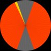
I'll take a look at the simplehud files when I get home, but I was able to make some test graphics using the normal one. The rotary function is hard-coded, but you can customize the singular tick graphic, so I'm running with that. The tick image is just one segment from a pie with 64 slices, each step on the bar is rotated 5.625 degrees, 25 steps per bar with 14 slices empty at the top and bottom. I've made an accurate pie in vector graphics, I can upload a PSD template if anyone is interested.
 
Posts
11
Likes
22
I've made an accurate pie in vector graphics, I can upload a PSD template if anyone is interested.

Sure, I could maybe have some use for the template later, I'm sure other people would find it useful aswell. You can link to it right in this thread if you want, make it easy for people to find it
 
Posts
7
Likes
4
Here you go. The yellow segment is the one used by the hud, so that is where you'll draw your tick graphics. The orange segments are the other positions on the radial, and the grey are unused. Zip file contains a PSD with vector paths.

hud_pie.jpg
 

Attachments

  • hud_pie.zip
    167.5 KB · Views: 449
Top